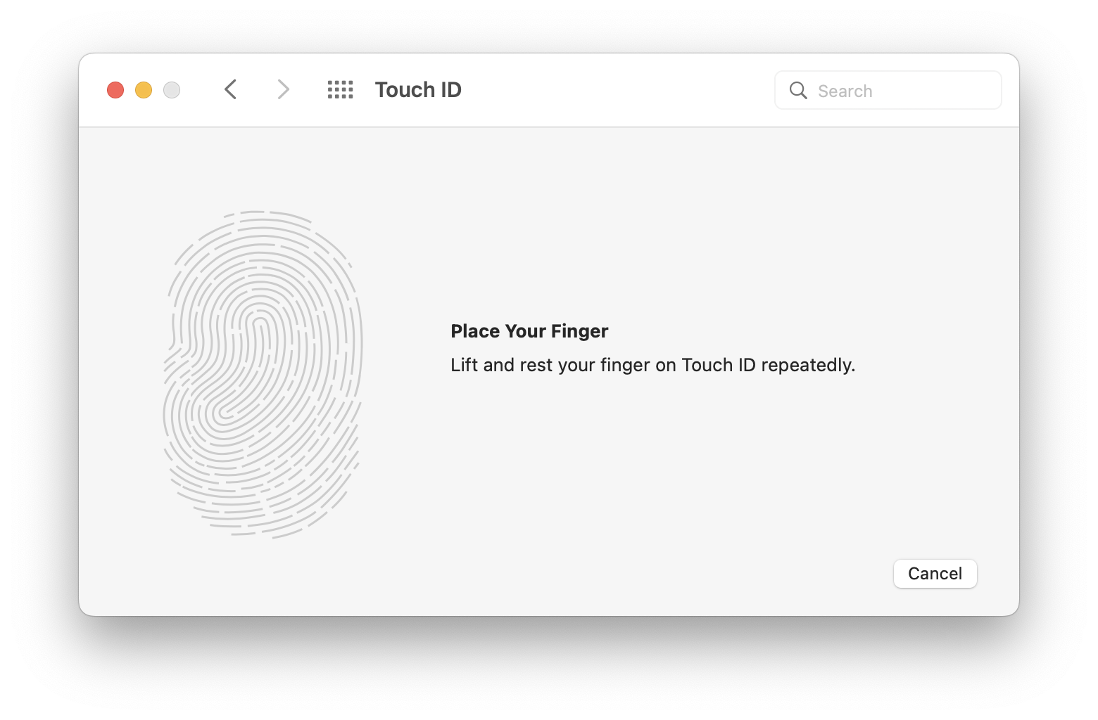
Today I helped a very smart friend set up a new Mac laptop with touch ID button. When it came to adding a fingerprint, she’d had a problem before I came along. Turns out she’d interpreted the instructions on screen as an invitation to touch the screen itself. Confusing UI!

That's a thing I have heard repeatedly—that folks aren't intuiting that the biometric element isn't actually elsewhere on the device. I agree it's a challenge.

This was confusing in the iPhone as well. Definitely worse on the Mac.

Well, it should have been so, I think. I’ve seen people do this on the iPhone.

@hjalm I spent a couple of decades working with 'beginners' on Macs. Those of us who know our way around computers, the Web etc don't easily realise just how confusing even the 'simplest' things can be. The window in the screenshot is labelled Touch ID; there's a huge 'fingerprint' on display, and phones and iPads have trained us to touch the screen itself. Plus vast numbers of people don't know the 'correct' terminology for things. I used to do support via phone and got used to people describing to me the 'box' on the screen (window) or various other attempts to tell me what they could see.

I kinda guessed that the blank black button would be the Touch ID. But it's not really clear anywhere indeed.
Also, there's Lenovo laptops that actually have touch screens, so that doesn't make things easier. (I got one from work for a while and was surprised/blown away when it reacted to me brushing a little bit of dust away. 😱 )

@Stefanyeah I was thinking the window in that screenshot just needed a couple of extra words, along the lines of "the Touch ID button on the keyboard above the Delete key"…

Indeed. Or a little keyboard icon with that key subtly hightlighed, like in black or red with a grey-ish outline for everything else. Just anything to give a hint, really.

@Stefanyeah There's two good ideas that took maybe 5 minutes between them (if that). The team who work on such things should have been able to figure that out…